|
|
Post by spyrofox on Mar 9, 2008 3:17:59 GMT 10
New Hoax. 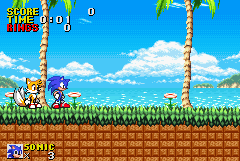 Sonic 2 Advancised. With a Tails sprite in the style on my Sonic one which took 2 minutes. The Rock Sucks. It's Emerald Hill if you can't tell. Or EmmHiil as the Filename says. =P |
|
Crash
Person with Lots of Posts
  
Posts: 480
|
Post by Crash on Mar 9, 2008 3:23:06 GMT 10
Doesn't beat mine. *shot* 8/10
|
|
|
|
Post by spyrofox on Mar 15, 2008 4:47:12 GMT 10
New Hoax!  Super Tails in SPA with Custom Life Icon and Flickies. I'm surprised this hasn't been done before. PM me if you want a set of SPA Life Icons I Made. |
|
Crash
Person with Lots of Posts
  
Posts: 480
|
Post by Crash on Mar 15, 2008 5:00:31 GMT 10
Good. 9/10
|
|
|
|
Post by SonicTailsEchidna on Mar 15, 2008 6:05:56 GMT 10
This Beats the Chao Garden DS Hoax! Well... Sorta...
9.5/10.
|
|
|
|
Post by spyrofox on Mar 18, 2008 11:01:43 GMT 10
And my two newest hoaxes! Of... Sonic the Hedgehog 4! Overdone yes but... Just look... 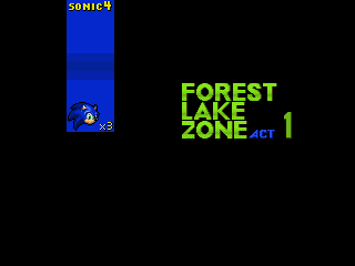 Title Card (NONOES) Thats NOT A S3&K Copy. I Hate S3&K's Title card style anyway. =P 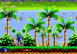 And the Above zone in action... As Sonic... and Tails... With semi-custom HUD. I'll Make 2 more sets with Tails And Knuckles too. Possibly a Title screen if I can find some good Pixel art... |
|
|
|
Post by SonicTailsEchidna on Mar 18, 2008 16:25:14 GMT 10
You gotta admit. They are pretty good.
8/10.
|
|
|
|
Post by Oberstleutnant Insipid on Mar 18, 2008 19:33:35 GMT 10
I don't like Forest Lake zone, the layers contrast too much and the palmtrees look awkward. The layering thing going on is interesting, how would that be implemented?
|
|
Neo // Racing Stripe A/V
Person with Huge Amount of Posts
    Icky icky tang pang fang clang spang
87%
professional skunk
Posts: 1,614
|
Post by Neo // Racing Stripe A/V on Mar 22, 2008 1:01:23 GMT 10
The bushes look like they're from Sonic XG...
|
|
|
|
Post by spyrofox on Mar 22, 2008 1:12:29 GMT 10
No. Isolated Island. I think... Either that or something from Sonic CD.
|
|
|
|
Post by spyrofox on Mar 24, 2008 2:13:26 GMT 10
More Sonic 4 With Everyone's Favorite Flying Fox.  Title Card 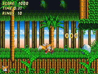 And the Zone itself Credit to Skylights for the AI Background and objects and other people for the Tails Sprites. Everything else is edited from Sonic 3. |
|
Crash
Person with Lots of Posts
  
Posts: 480
|
Post by Crash on Mar 24, 2008 2:23:49 GMT 10
The HUD numbers look a bit dodgy. Also, it would look better if the "1" number on the title card was shaded like the letters. 8/10
|
|
|
|
Post by spyrofox on Mar 24, 2008 2:54:24 GMT 10
I Already had this next batch done before you Said that...  Another Title card  And Zone. With Knuckles. (Yes, The HUD's not Correct. Ignore it) I dunno what Character to use next. Shadow? Amy? Cream? Suggestions please. |
|
Crash
Person with Lots of Posts
  
Posts: 480
|
Post by Crash on Mar 24, 2008 3:04:17 GMT 10
I say Amy, because she's one of the classic characters. =P Still 8/10.
|
|
|
|
Post by spyrofox on Mar 24, 2008 3:18:07 GMT 10
Modern or Classic Amy Look?
|
|